Our visual system processes a massive amount of info in a chaotic world of imagery & data. The brain recognises patterns, objects & shapes then organises them into whole forms for us to understand it better.
The principles include Similarity, Proximity, Closure, Figure – Ground, Continuity & Common Fate – they help to create relationships or differences to better organise & convey information.
A. Similarity
Elements that are similar are perceived to be more related than elements that look different affected by colour, size, shape & orientation.
– Colour

Coloured Shaped have a strong effect in assigning a group or relation, even with different shapes
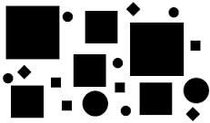
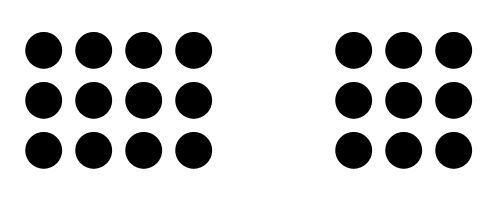
– Size
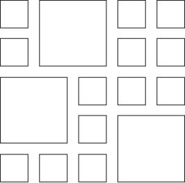
Size causes the larger shapes to stand out & form a group even though all shapes are the same
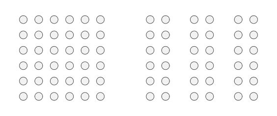
– Shape
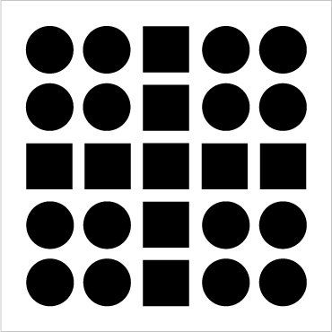
Weakest grouping effect compared to colour & size. We perceive it as columns of circles & squares rather than alternating circles & squares
– Orientation
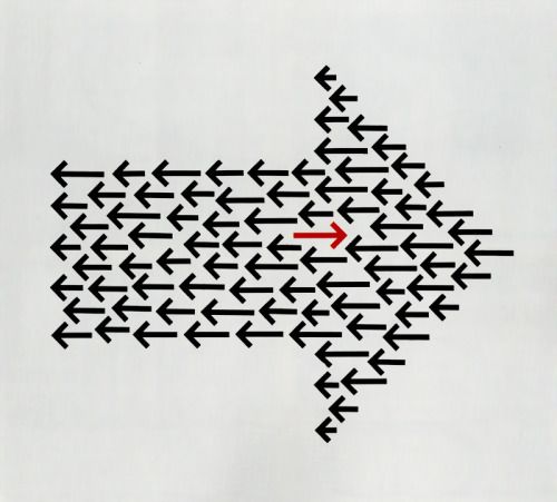
They appear to be almost moving together in contrast with the shapes around them
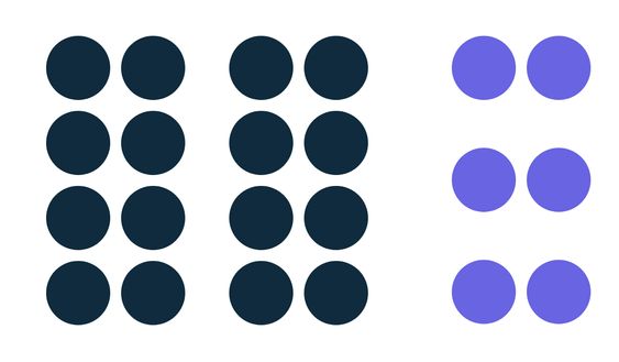
– Colour Overrides Shape
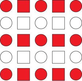
We perceive alternating rows of red & white shapes as compared to columns of circles & squares
– Colour Overrides Size
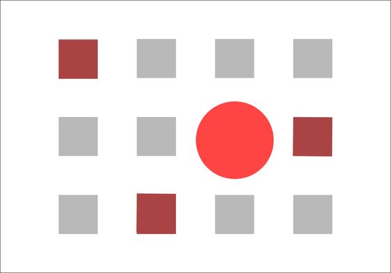
We perceive with large red squares as one group & the single large white square as unrelated
A2. Examples of Similarity Used In Real Life
Cheez.it Print Advertisement
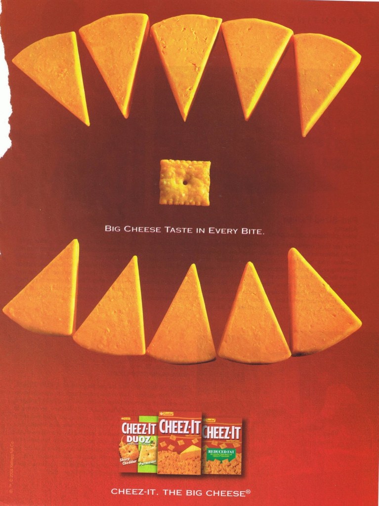
The cheese triangles form 2 distinct groups that are spaced apart but are similar. The lone Cheez.it cracker is in the middle on its own group. Altogether as a whole in our minds, the grouped triangles form a shape of fangs in a mouth closing in on the Cheez.it cracker.
GIORGIO ARMANI Magazine Advertisement
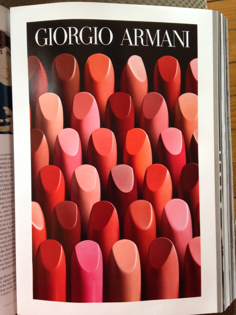
The many shades & hues of the lipsticks may seem to form their own unique groupings but due to their placement in rows, they all come together to form lines of neatly placed lipsticks that stand out in this commercial. Another thing to note is the randomly placed lipsticks in each row that point in a different direction, they themselves will form their own disjointed groups in the rows. Overall the unique groupings and orientations of the lipsticks form a interesting scene that attracts the viewer.
B. Proximity
Elements that are closer together are perceived to be more related than elements that are further apart. It helps us organise objects in relation to other objects.
Spread Out
Spread out circles exhibit no relation with each other, they will be perceived as individual or separate objects.
Organised Together
When pulled in close to one another, the circles are assigned to be related to one another, they are no longer perceived to be separate objects.
White Space
Adding white space helps us to perceive things differently. White space can be used to strengthen the groupings as well as to differentiate the groups from other elements.
Proximity Trumps Everything Else
Proximity wins out over colour & shape because the groupings formed by proximity will still enable us to differentiate between groupings formed by other means.
B2. Examples of Proximity Used In Real Life
By Grouping
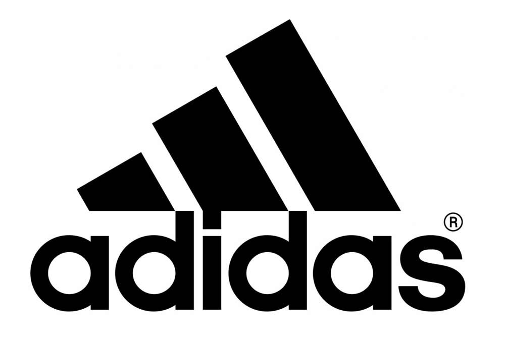
The 3 main bars form the iconic striped logo of Adidas but on their own, they would seem out of place. Furthermore with the angled shapes form and ends at a tip, the overall shape can be seen as a group. Bringing the focus to the Adidas name itself, the proximity it is placed in connection with the bars unifies the whole Adidas Brand Logo together.
By Combining Proximity & Similarity
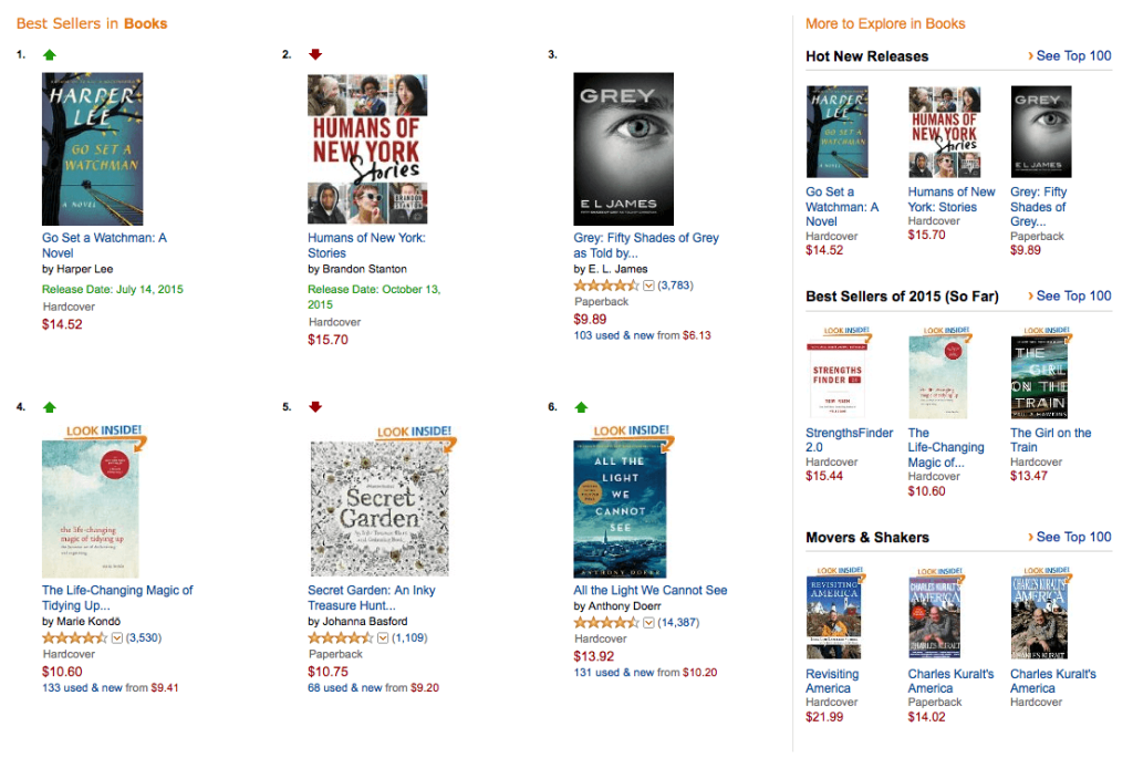
The books found in the Amazon store show groupings formed by the different rows and further divided by their segments. Similar books are placed in the ‘Best Sellers in Books’ category while the rest of the books are separated to the right column, showing the differentiation in overall category.
Proximity & Hierarchy
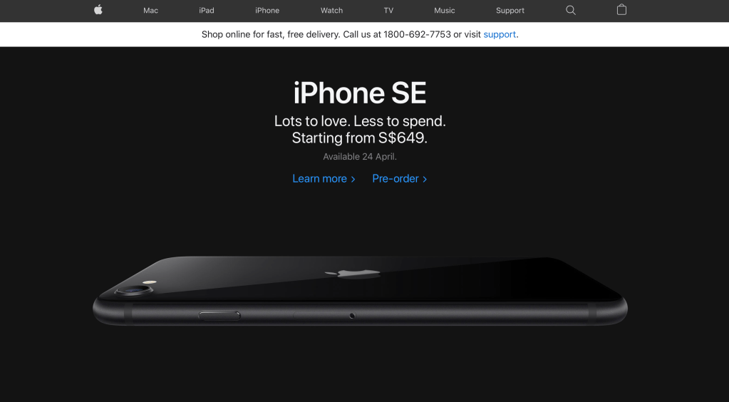
From the Apple Singapore online store, we can clearly see the hierarchy of the webpage, the categories are grouped and placed in the top bracket to show the different types of products while be separated by the different thickness and colours of the webpage. The highlight (main hierarchy) is given to the flagship product that has been newly launched and placed in its own bracket. The consumers (us) can immediately see what they’re trying to sell to us as our attention is drawn to the largest visual (iPhone SE).
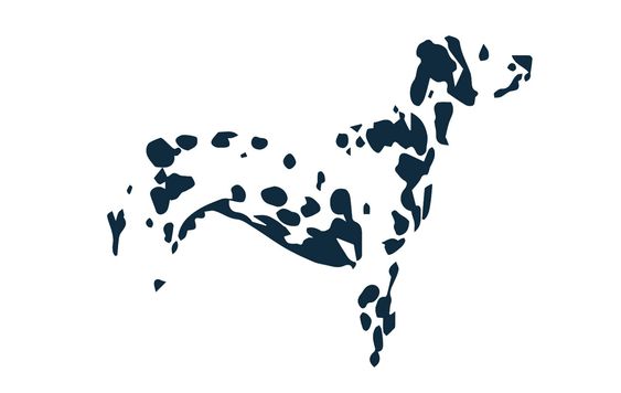
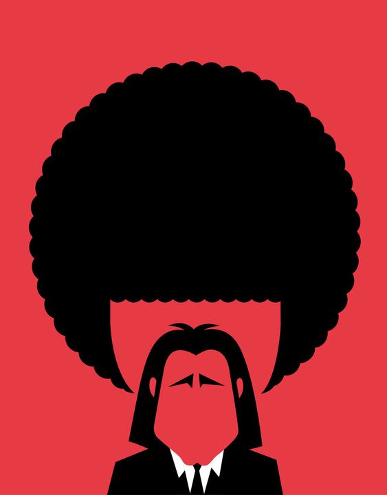
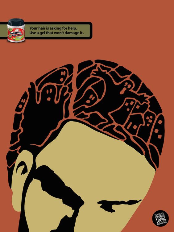
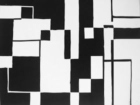
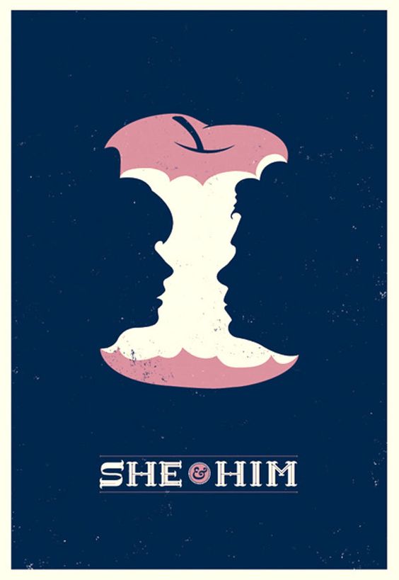
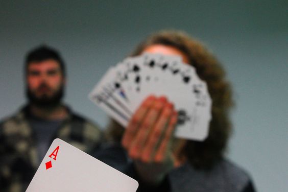
C. Closure
Humans have a tendency to perceive a set of individual elements as a single recognisable pattern. Closure helps to decrease the complexity of the required elements by reducing elements to the fewest possible parts needed to fully complete an object.
Our minds complete the lines to form a circle. Positive & negative space combine here to form our perception of a circle in our heads.
Using the smallest amount of information, closure can be used to perceive objects or patterns. However if not enough information is there to complete the pattern, our minds are unable to perceive the object & it will be difficult to produce a pattern in our heads.
C2. To Bring About Effective Closure In Our Designs
Positive & Negative Space
Combines in closure to form a whole. Looking for the hidden forms in the negative space of the design or type.
Contrast
Create a strong contrast between the foreground elements & the background elements. Try to experiment with complementary colours to bring about some of the most effective contrasts.
Colour
Use colour to add life & reinforce relationships between elements that will bring about effective closure to our designs.
C3. Examples of Closure Used In Real Life
NBC Logo
The NBC logo brings about the multi coloured patterns together to form a fan while providing the negative space to create the peacock icon, the whole design is tied together to form a brightly coloured peacock without implementing an actual drawing of a peacock.
FedEx Logo
The tracking of the FedEx logo is purposely held tight together to show the brand’s commitment to speedy deliveries, the ‘Ex’ also forms an arrow in the negative space that gives the impression of speed & efficiency.
Unilever Logo
Unilever as a whole produces an immense set of household products as shown in their unique logo that is filled with icons the products that they produce, it also forms the unique ‘U’ that represents the Unilever Group.
To Create Icons
Simple expressions of words are created with the different shapes being brought together with negative space. These designs are direct & easy to understand, though simple, it is filled with thought to directly translate words in designs.
Abstract Closure
Even with more abstract & diverse expressions, negative space can help to easily translate deep meanings into the spoken language with design.
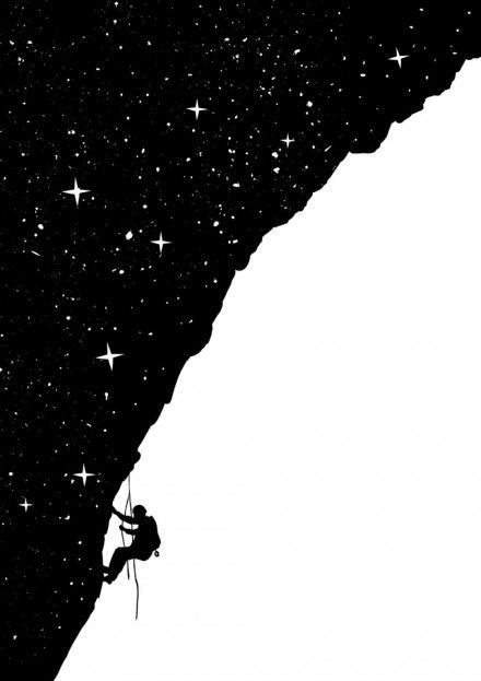
D. Figure – Ground
The state which we perceive elements as either the objects to be in focus or for the background to be in focus.

The Figure – Ground is stable when objects are distinguishable from the Background & the Background holds no interest. Stable Figure – Ground provides a setting for objects & allow us to focus attention on where we want it to be.
The Figure has shape & is perceived to be in front while the Background is shapeless, continuing behind the Figure at a further depth.
In an unstable Figure – Ground, there is an ambiguity that is introduced & the relationship between the Figure & Ground is unclear.
The Figure & Ground are reversible; thus making us alternate our perception between seeing each item as the Figure & then the Ground.
Ambiguity isn’t always a bad thing. Purposefully destabilising the Figure – Ground relationship can introduce discord or tension; thus adding excitement & interest to the design.
D2. Creating Good Figure – Ground Relationships
Using these elements to reinforce the perceived Figure – Ground relationships in our designs
Contrast
Complementary colours are great for creating contrast. Alter the value of colours if its too intense
Colour
Warm colours are perceived as approaching; these strengthen the Figure.
Cool colours are perceived as receding; these strengthen the Ground.
Size
A large element that fills the majority of the ground will be perceived as the figure.
A small element in the large ground as the ground.
Position

Elements in lower areas are perceived as the Figure. Elements that are lower will seem nearer to us.
Elements in higher areas are perceived as the Ground. Elements that are higher will seem further away from us.
Focus
Elements in focus are perceived as the Figure.
Elements not in focus, are blurred, faded or tinted are perceived as the Ground.
D3. Examples of Figure – Ground Used In Real Life
MAX Shoes – You Are What You Wear
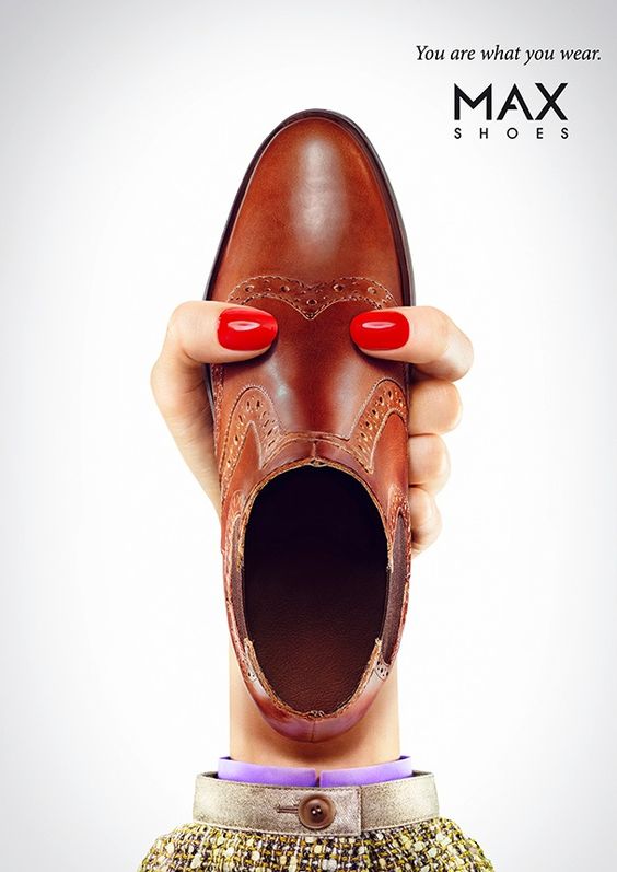
The Advertisement uses the placement of the arm holding up the shoe to show the relative position of the whole visual. The wrist of the arm is positioned at the bottom of the ad, giving reference to the overall image that it represents the ‘neck’ & subsequently the shoe itself represents a head with an open mouth.
HEINZ – When Fries Can’t Resist The Attraction

This ad uses the ‘Focus’ & ‘Size’ to indicate the relative distance of the fries and ketchup bottle, thus bringing about a show of movement of the whole image. The fries out of focus shows the extreme closeness it is to the viewer as well as its size is relatively as large as the bottle in the background.
Football – A Self Made Poster by Pandanj
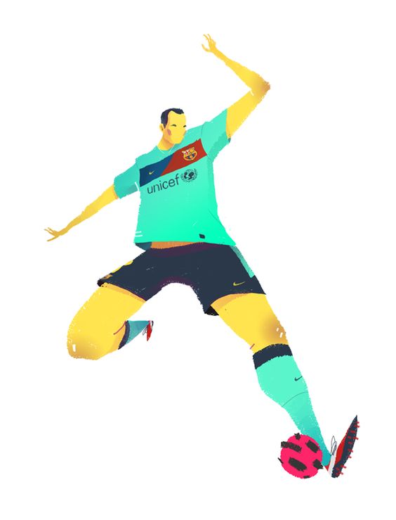
The poster uses a warm colour to show the closeness of the ball to the viewer as compared to the cooler colour of the player’s uniform to show the distance from the viewer. Furthermore the position of the player’s head & upper body is at the top of the poster which is also smaller, showing that the upper body of the player is further back (receding into the background).
E. Common Fate
Humans perceive element that move in the same speed & / or direction as parts of a same group.
F. Continuity
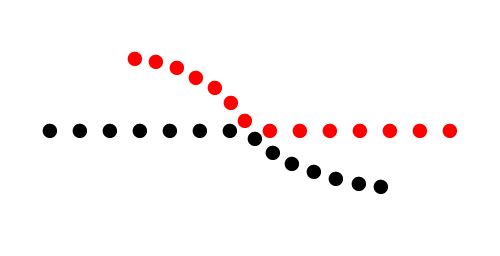
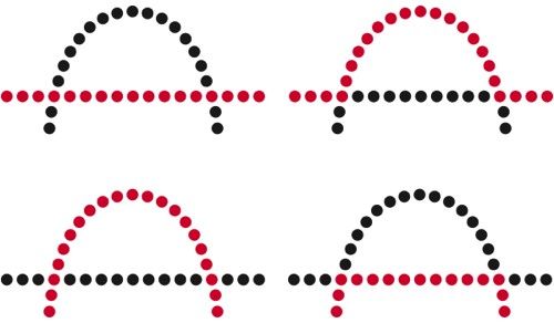
Oriented units or groups tend to be integrated perpetual wholes if they are aligned with each other.
G. Common Region
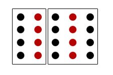
Highly related to proximity. Elements located in the same enclosed region are perceived to be grouped together.
Add borders or visible barriers to create separation between groups of objects even with the same proximity, shape or colour.
H. Focal Point

Whatever stands out visually will capture & hold the viewer’s attention first.
Ending Notes
These are the theories behind Gestalt, use them in your designs to bring about a better design feature or use them in excellent taste to give your design that extra OOMPH to wow your viewers, they wouldn’t know what made your design so good.

This is such a cool and innovative post about something I didn’t know existed!
How do you think these designs affect a person’s psychology? I am quite excited to learn about its answer from you.
Regards,
Kiran
LikeLike