The Principles Of Design

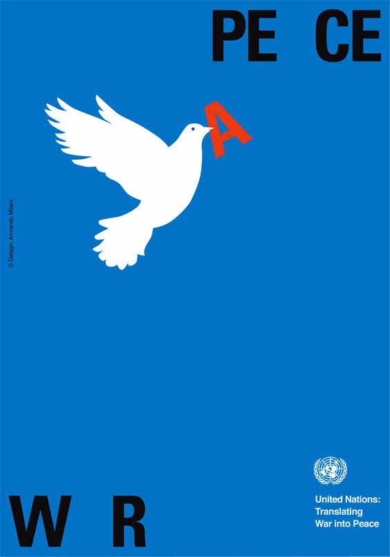
Contrast
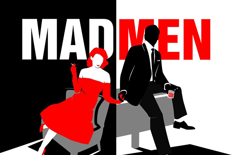

It helps visual elements to stand out from one another. The need for higher contrast brings focus to design elements that can help further elevate your point to be brought across. Conversely, the lack of contrast can be used to lower focus on elements that contribute or support the design as a whole but are not the main idea.
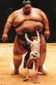
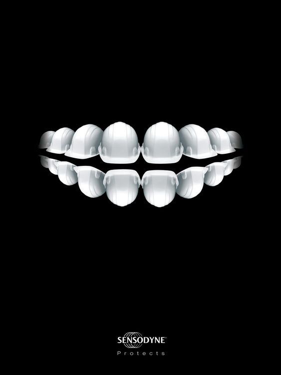
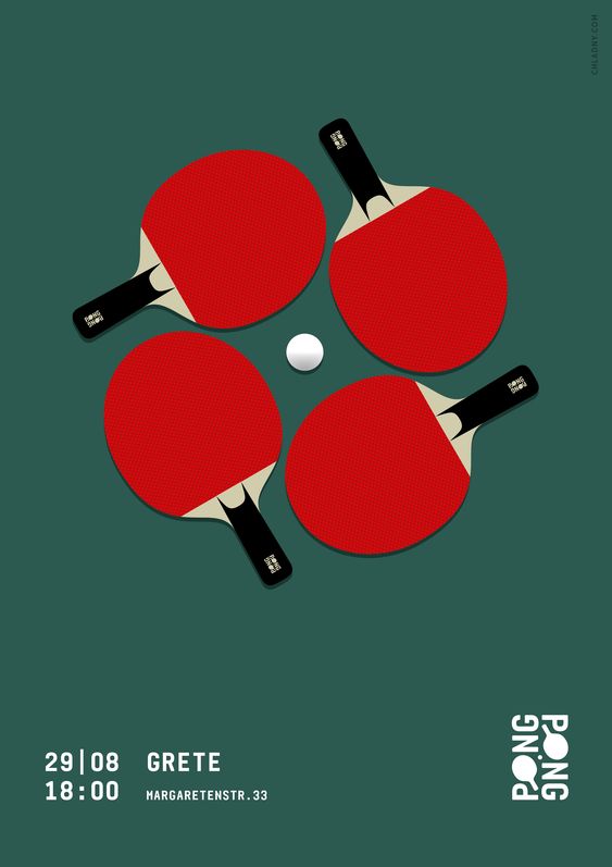
Balance

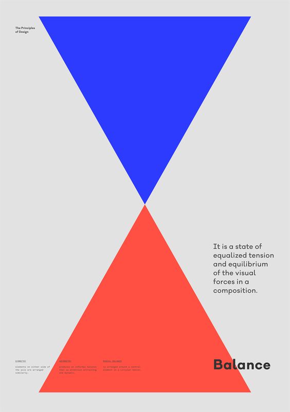
Elements in a design hold visual weight. The placement of each element on a design will create a feeling of balance. Will the design fill assymetrically tipped to a certain side or will the whole design feel equal & ‘balanced’ equilaterally? Balance of a assymetrical design will have elements of differing weights laid out. Symmetrical designs will have elements of similar visual weight laid through out the layout. Radial balance will have elements laid out from a single point spreading out around the point.
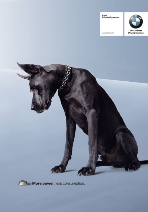
Emphasis
Similarly to contrast, emphasis helps certain elements that hold greater value (in relation to the design as a whole) to stand out. Secondary information can be allowed to recede into the backgroud to give support to what the design was intended to say.
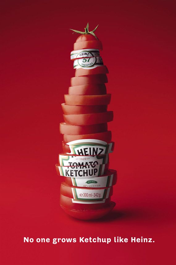
Proportion
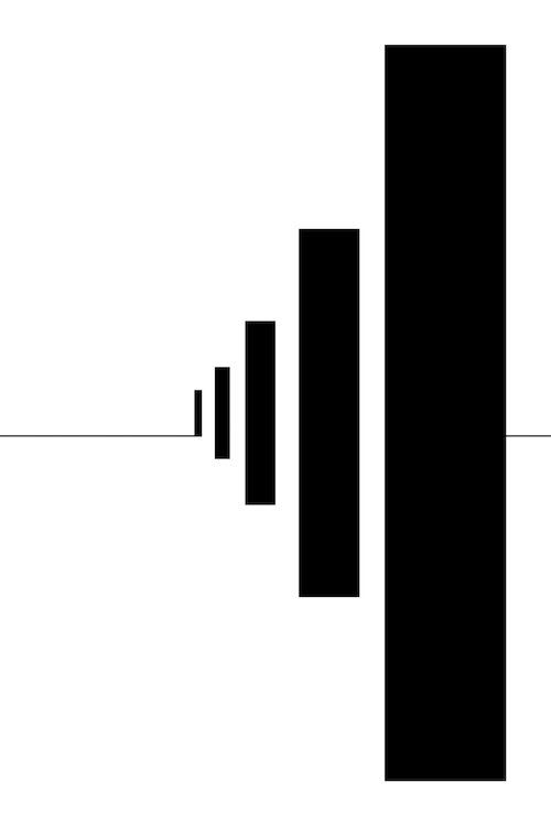
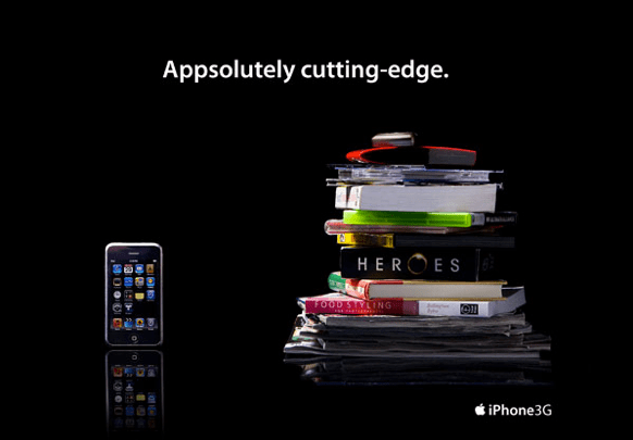
Design elements also hold literal visual size, relative to one another on a layout or relative to actual size in real life. It gives a reference point to understanding the focus (main message) of a design.
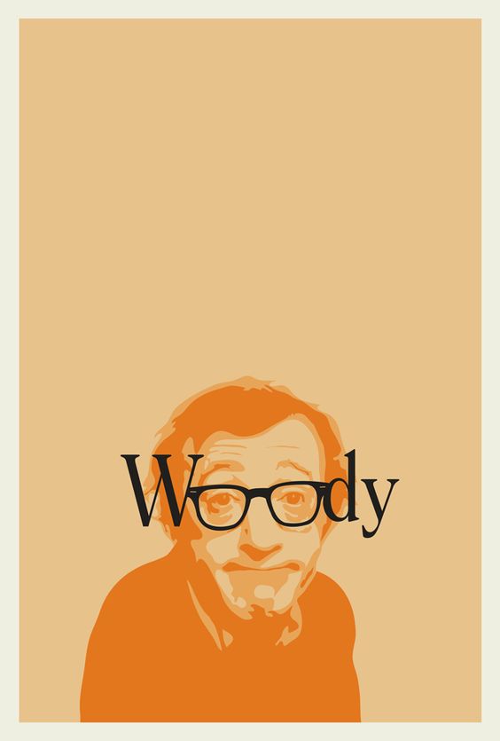
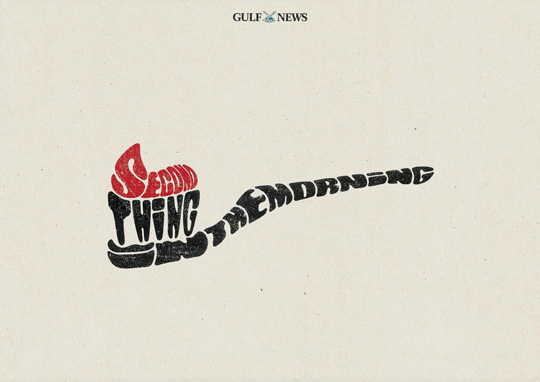
Hierarchy
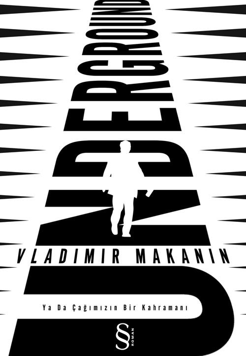

It shows the main message or objective of the design, helping the viewer to understand the message better. Larger texts (headlines) give direction while smaller texts (body) drives the message across in the details. Overall working together to help deliver a feeling or message to the viewer. A good design uses hierarchy that will help its viewer immediately understand its intention.
Repetition
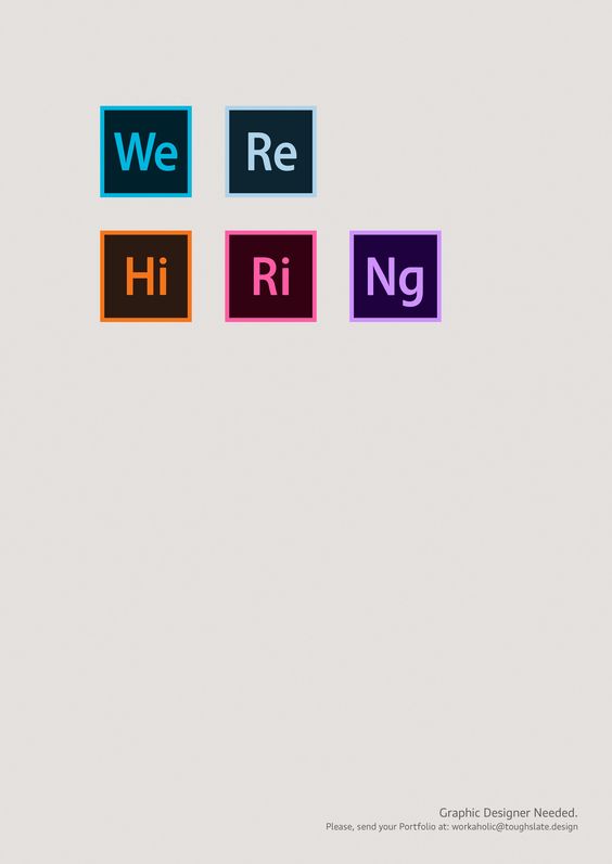
It helps to reinforce a message of a design, as well as to bring unity to a design as a whole. Different pages of a whole design may say different things but by the specific way they are laid out similarly will help bring unity & consistency
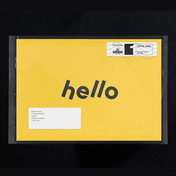
Negative Space
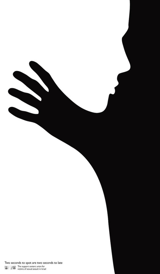
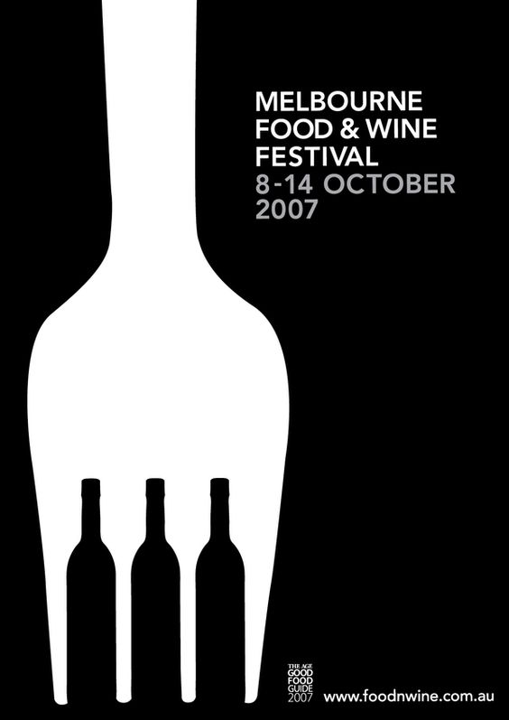
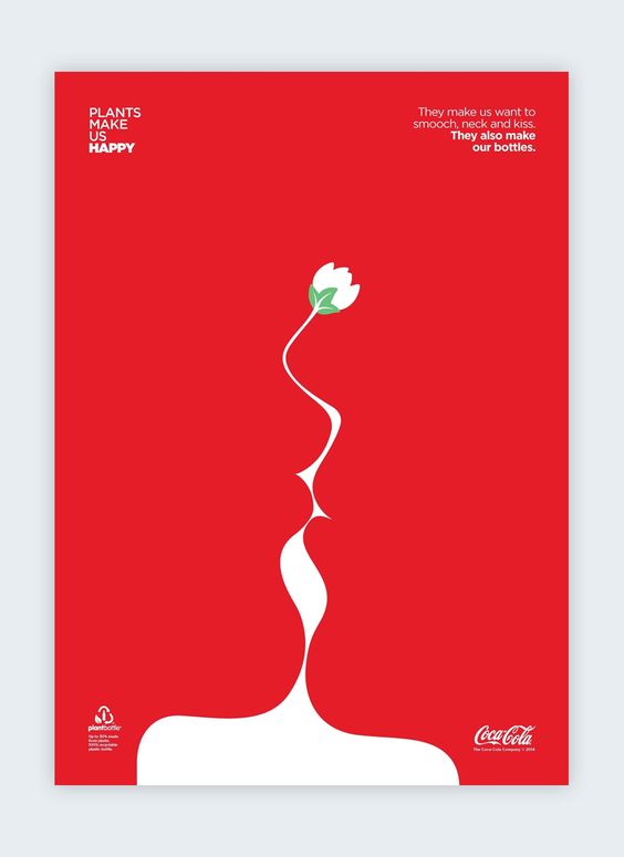
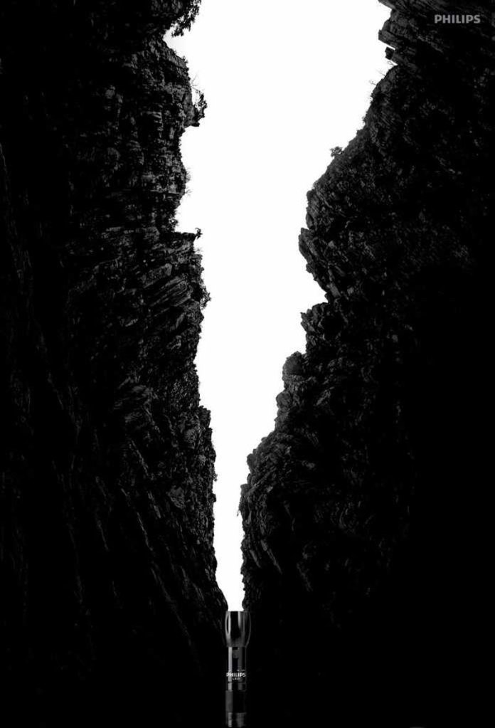
It helps the user see the important details better. The lack of info brings focus back to the message. Information like color, graphics or words can distract the user. Eliminating uneccessary elements also brings about a luxurious feel. Typically negative (white) space can show the ability to afford such space to be used as negative space.
Colour
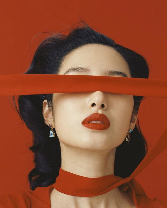
Colours can invoke feelings about the brand, design to eventually persuade people to do something. Colours can mean a wide variety of things in different countries, cultures & context. Matched with shapes or on packaging, they help form an impression of the design or product in your mind.

Leave a comment